Friday 11 April 2014

Alexander Meli

http://www.designerwallpapers.co.uk/alexander-meli/the-untold-story/dandelions.html
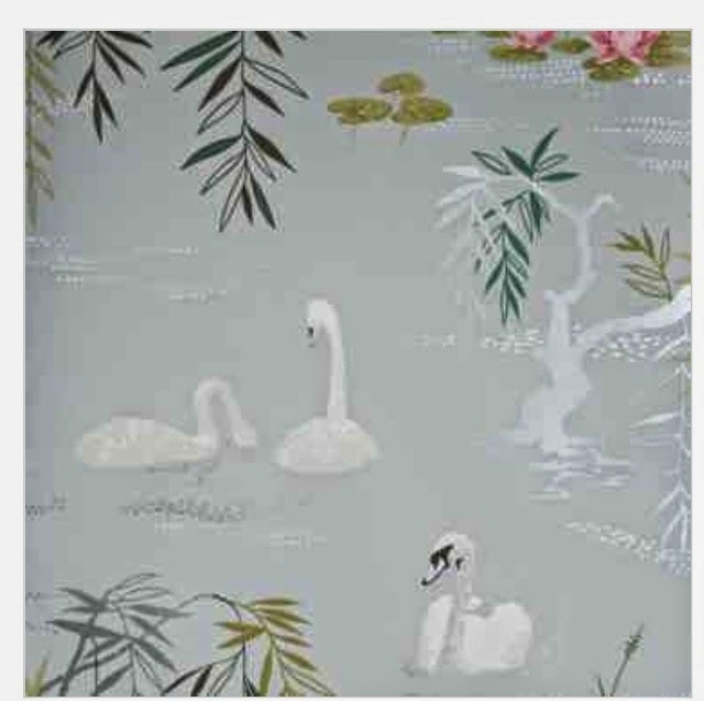
Found this wallpaper on the designer wallpaper website under the new collections. I liked this design true for what it is is built up of, as I have always been drawn to dandelion seaded flowers, and also the way in which it was drawn. The use of media which has been applied in a quick manure showing movement in the design, the use of overlapping the images exxagurates this. The use of fine lines and marks works well giving a realistic look, I also like the contrast between the black and white colour pallet     . However the designer has still managed to create various shading making parts bolder than others. 

Designers guild inspiration

http://www.designerwallpapers.co.uk/designers-guild/amrapali/amrapali-peony.html
Here is a small print from the designers guild collection, It is a small repast pattern that is built up of two floral arrangements. They have used a bright, powerful and lively colour pallet which is exaggurated by the crisp white background. The use of these bold colours suggests to me that this design is  targeted towards the summer season. The used of mark making is very detailed giving each section of each floral tonal qualities. 

Embroidery top

Finally fully finished with the collar on. 

Nina inspiration

http://www.designerwallpapers.co.uk/nina-campbell/sylvana/swan-lake.html#grey-wallpaper-tint-1
Nina Campbell inspired my within this wallpaper pattern as the use and amount of detail put into it creates a realistic feel. The use of mark making and the composition of the picture plane creates depth and space within the images giving it a foreground and background setting parts back and bringing overs forward. The colour pallet is soft, light and gives of a calming and tranquil atmosphere from the use of feather like colours. 


Osborn and little inspiration

http://www.designerwallpapers.co.uk/osborne-little/hothouse-by-suzy-hoodless.html

Osborn and little

Gorgeous repeat pattern by Osborn and little, here are a few bullet points to describe how I feel about this wallpaper; 
- feminine colour pallet 
- delicate detailed floral 
- suttle background to exaggerate and make thd pink on the flower stand out more 
- use of block media stylises the flower making it more 3d as well 

Friday 4 April 2014

Libertys print

By Darby A Tana Lawn 
http://www.liberty.co.uk/fcp/product/Liberty/liberty-art-fabrics/Darby-A-Tana-Lawn/97359

Come across this gorgeous printed fabric within my research, it gives off a relaxed feel with the use of calming and tranquil colours. The use of feathers gives a flowing feel to the repeat pattern, the textured blue spelled background with the hint of green give an almost windy/ breezy feel to it. The use of rich red draws you to the eye of the peacock feather. 

Friday 28 March 2014

Floral arrangement

Few words which describe why I photographed these flowers;
Powerful
Big
Grand 
Roses 
Monocromatic 
Bold 
Outstanding 
Exploding 

Stained glass


Gorgeous glass ceiling window, bright colours caught my eye and the fine floral like designs. 

Inspiration

Wynyard hall lighting; I found this peice of work on my daily travels and I thought it just looked so spectacular. The elegant form from the way it is hung is so dramatic it instantly catches your eye. The bright light reflects of all the indevidual peices of glass creating many colours rays to form and shimmer. 

Trace experimenting


Here shows many experiments with my drawings using techniques such as mirroring, Infills, rotations, repeat and many more. This gave me the chance to explore new designs and looks to mh work. 

Colour pallet tester

Here I have selected parts of my first colour pallet tested and applied them to a small drawn out section of the design to see how well they would work together. I feel they worked well because of the use of colours and techniques on the plain back ground. 

Repeat pattern number 4

This repeat pattern is again a half drop however this is a small square repeat. I feel that this is to simple of a design and the pattern is all of a vertical and horizontal feel which gives it a formal feel to it. 

Colour testing sheet

Here shows a repeat pattern that I chose to develop further to a final design, this image here shows how I have explored colour, media and texture towards my design using the colour pallet that I selected. I have explored medias such as inks, dyes, brusho, acrylic paint, watercolours, pencils, pens and many more. I have applied these in different ways to create different effects. I looked at which medias and colours worked well together, here shows close up images of the colour sheet that I created; 


Repeat pattern number 3

This next repeat pattern is a rectangular grid repeat which I have made look more complexed through the amount of images that I have included, I wish to use this as a final design. 

Repeat pattern number 2

This repeat here was the second one that I created, I began by drawing out a rectangular half drop grid on my a1 peice of paper. I used the rectangular shape as it gave me a bigger picture plane to work with, meaning I could either use bigger images or add more images as I had more space to work with and to fill. I used a mirrored effect to create a repeat within the repeat. The half drop image means when I repeat the images within the central box will be repeated half way down the middle box meaning it creates a diagonal repeat instead of a virtical repeat. 

Repeat pattern number 1

This was the first repeat pattern I created, I used the square grid styled layout and using the images that I had drawn and created, I photocopied them numerious amounts of time and then played around with the composition of the main square repeat Untill I come up with this one which I was happy with. I then reappeared the center pattern inton each box that I had drawn out to get a feel for what it would look like as a repeat pattern. 

Drawing for interiors

First drawing sheet; I feel it is too suttel and doesn't depict my concept of discord enough. The colour pallet is too sort and light giving off more of a delicate atmosphere rarther than a bright bold atmosphere. 

Tuesday 25 March 2014

Today's recap lesson

Going back through important factors of the assignment breif;
-learning outcomes 
- research 
- use informations for a defined range 
- primary and secondary sources 
- variety of application 
- communicate information accurately 
- assessment criteria 
- work required;
- 200 word report on your own idea which links to what we are studying
- use footnotes, reference ect 
- web blog 
-Hard copy and digital copy of report 
- deadline - wed 23rd of April by 4pm 


Friday 21 March 2014

Interior repeat grids

Here are the basic grids that I have drawn out to create a repeat, I will create 4 layouts using these grids and photocopies of my work. I will then select two of the best layout for my final repeats    , here are the basic grid designs that I am working from;


Final top embroidary

The only thing left to go on is the collar. I have layered two peices of fabric up however I have only worked onto the top fabric. Here are some close ups of the embroidered detail; 


Tuesday 18 March 2014

Inspiration

Here shows a picture which I took in my local pub as it had just been done out. I really liked the new wallpaper and accessories in the place as they were suttel however they fit in well with the surroundings as it gave off a cottage and vintage feel with the use of monocromatic colour pallet used which worked well with the collage of old photographs. 


Friday 14 March 2014

Flowers


Here are some images of flowers that I took, I used the sunlight to pic us the lighter areas and also to create shading. I had photographed flowers to work from for my new drawing sets for the interior side of my main program module. I chose bigger flowers to work from that had more detail within them. 


Contents page

I have began to structure my shop report, this is how I am going to group my facts and resources, within these headings. 

Top garment embroidery

This is my finished embroidery for my too garment peice, I now have to stretch it and cut it down to shape. 

Photographic research

Here shows more photographic research, I have included florals into the horse life and accessories. To show a discord concept as they too wouldn't normally be  placed together. 


Wednesday 12 March 2014

Texture

Here shows one of my creative backgrounds that I have created by applying brush to a layer of water that I have washed onto the paper. I use three different shades of colours these were; Turquious, lemon and leaf green. The colours instantly bled into the water, I took away some of the exess water using a paper towel, I then dabbed the paper towel all over the paper as I felt it created a unusual texture. I will now go in to work on top of this. 

Thursday 27 February 2014

Report shop research

These are my notes that I took when I went to store today. 
But need to go again and find out some more.